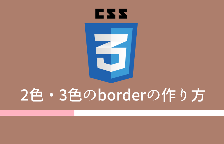
今回作りたいのはこういうやつです。
普通、borderプロパティで1辺に設定できる色は1色だけですが、工夫次第では2色・3色に設定できます!
コードを見てもらえれば分かるんですが解説もつけておきますね◎
その1.borderの色を左右で2色に分ける
html
<div class="border border01">おはようございます</div>css
.border{
  width: 200px;
  margin-bottom: 10px;
  border-bottom: 2px solid #ccc;
  position: relative;
}
.border01::after{
  content: "";
  display: block;
  border-bottom: 2px solid #f00;
  width: 50px;
  position: absolute;
}
元のボックスにborderをつけたあと、疑似要素afterでそのborderに重ねるように別の色のborderを付けています。
その2.真ん中だけ色を変える
html
<div class="border border02">こんにちは</div>css
.border{
  width: 200px;
  margin-bottom: 10px;
  border-bottom: 2px solid #ccc;
  position: relative;
}
.border02::after{
  content: "";
  display: block;
  border-bottom: 2px solid #f00;
  width: 50px;
  position: absolute;
  left: 0;
  right: 0;
  margin: auto;
}
基本的な考え方は先ほどのものと同じ。
position: absoluteとleft: 0; right: 0; margin: auto; を併記することで、親要素に対して左右中央に来るという特性を利用して、
親要素の左右中央に疑似要素afterが来るようにしています。
その3.borderを3色設定してみる
html
<div class="border border03">こんばんは</div>css
.border{
  width: 200px;
  margin-bottom: 10px;
  border-bottom: 2px solid #ccc;
  position: relative;
}
.border03::before{
  content: "";
  display: block;
  border-bottom: 2px solid #00f;
  width: 80px;
  position: absolute;
  left: 0;
  bottom: -2px;
}
.border03::after{
  content: "";
  display: block;
  border-bottom: 2px solid #f00;
  width: 80px;
  position: absolute;
  right: 0;
}
疑似要素beforeとafterを駆使して、最大3色までなら一つのボックスに対して設定できるんじゃないかなという例です。
beforeはborderの太さぶん下に下げてあげる必要があります。
cssで書くことで、animation プロパティでおしゃれなアニメーションを付けることも可能になるので、
こういうちょっとした装飾もcssでやっておくほうが運用性高しですね!!
よいborderライフを!!